The problem is to create a widget that contains some decoration or controls, but also has a sub-window where people can put their own widgets.
For example, I wanted an "accordion" control that had a checkbox at the top to open and close it, then to be able to put any other control inside this.
The way it will be structured is a QAccordion, with a VBoxLayout, will contain a QCheckbox and a QWidget called the content widget. This content widget will have its own VBoxLayout, where the controls will go.
You will create two classes: one called (say) QAccordion, which implements the widget, and one called QAccordionInterface, which tells Designer that it's available.
<#include <qwidget>
#include "GeneratedFiles/ui_QAccordion.h"
#include "Export.h"

class SIMUL_QT_WIDGETS_EXPORT QAccordion : public QWidget
{
 Q_OBJECT

 Q_PROPERTY(QString title READ title WRITE setTitle DESIGNABLE true)
 Q_PROPERTY(bool open READ isOpen WRITE setOpen DESIGNABLE true)
public:
 QAccordion(QWidget *parent = 0);
 ~QAccordion();
 void setTitle(QString f);
 QString title() const;
 void setOpen(bool o);
 bool isOpen() const;
public slots:
 void on_accordionCheckBox_toggled();
 void setSearchText(const QString &);
signals:
protected:
 void childEvent ( QChildEvent * event ) override;
 void paintEvent(QPaintEvent *) override;
private:
 Ui::Accordion ui;
 bool setup_complete;
 QWidget *contentsWidget;
 void hookupContentsWidget();
};
<?xml version="1.0" encoding="UTF-8"?>
<ui version="4.0">
 <class>Accordion</class>
 <widget class="QWidget" name="Accordion">
  <property name="geometry">
   <rect>
    <x>0</x>
    <y>0</y>
    <width>671</width>
    <height>336</height>
   </rect>
  </property>
  <property name="sizePolicy">
   <sizepolicy hsizetype="Preferred" vsizetype="Preferred">
    <horstretch>0</horstretch>
    <verstretch>0</verstretch>
   </sizepolicy>
  </property>
  <property name="windowTitle">
   <string>Accordion</string>
  </property>
  <layout class="QVBoxLayout" name="verticalLayout">
   <item>
    <widget class="QCheckBox" name="accordionCheckBox">
     <property name="text">
      <string>Accordion</string>
     </property>
     <property name="checked">
      <bool>true</bool>
     </property>
    </widget>
   </item>
  </layout>
 </widget>
 <resources/>
 <connections/>
</ui>
But: if we were to create the whole thing, including the contents widget in here, after we built the class the contents widget would NOT be accessible in Designer, and neither would its layout be recognized. So instead we put these in a function called domXml in QAccordionInterface.
 QString QAccordionInterface::domXml() const
 {
     return "<ui language=\"c++\">\n"
            " <widget class=\"QAccordion\" name=\"accordion\">\n"
            "  <property name=\"geometry\">\n"
            "   <rect>\n"
            "    <x>0</x>\n"
            "    <y>0</y>\n"
            "    <width>100</width>\n"
            "    <height>24</height>\n"
            "   </rect>\n"
            "  </property>\n"
            "  <property name=\"toolTip\" >\n"
            "   <string></string>\n"
            "  </property>\n"
            "  <property name=\"whatsThis\" >\n"
            "   <string>.</string>\n"
            "  </property>\n"
      "  <widget class=\"QWidget\" name=\"contentsWidget\" native=\"true\" >\n"
      "   <layout class=\"QVBoxLayout\" name=\"accContentsVLayout\">\n"
      "    <property name=\"spacing\">\n"
      "     <number>2</number>\n"
      "    </property>\n"
      "    <property name=\"leftMargin\">\n"
      "     <number>2</number>\n"
      "    </property>\n"
      "    <property name=\"topMargin\">\n"
      "     <number>2</number>\n"
      "    </property>\n"
      "    <property name=\"rightMargin\">\n"
      "     <number>2</number>\n"
      "    </property>\n"
      "    <property name=\"bottomMargin\">\n"
      "     <number>2</number>\n"
      "    </property>\n"
       "    </layout>\n"
      "  </widget>\n"
            " </widget>\n"
            "</ui>\n";
 }
By specifying the contents widget and its layout here, Designer will know to dynamically create them when you add a QAccordion, so they'll appear in the editor. You can then drag any control into the contents widget, and it will be correctly positioned. Be careful that you drag it to the contents widget and not the QAccordion itself or a subcontrol. Designer doesn't properly obey its "isContainer" function, so it sees any custom control as a container, not just the ones you indicate.So now in designer, we can add QAccordions. Without styling they just look like checkboxes with a space below where you can drag controls:

After applying some styling, the final result looks like this:
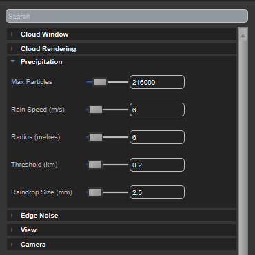
The accordion elements - Cloud Window, Precipitation etc are inside a searchable property panel, implemented on the same principles.
And here are the files for the final class:
QAccordion.zip
No comments:
Post a Comment